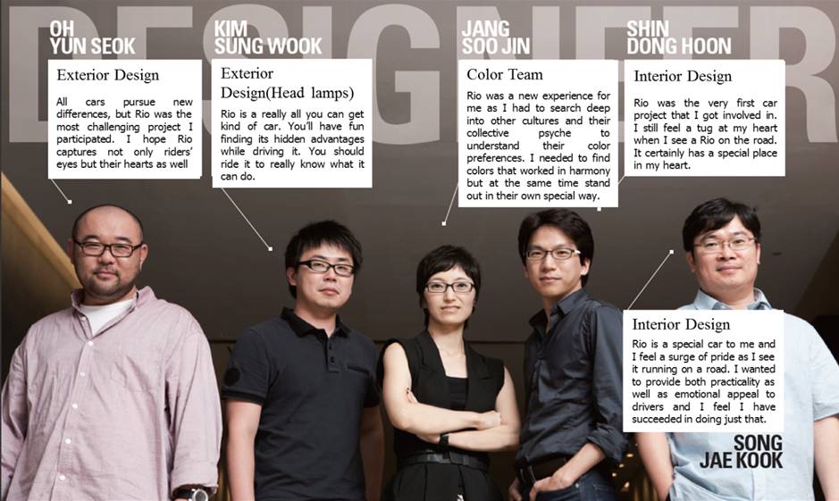
Click to view “Kia Rio design story I: Exterior”.
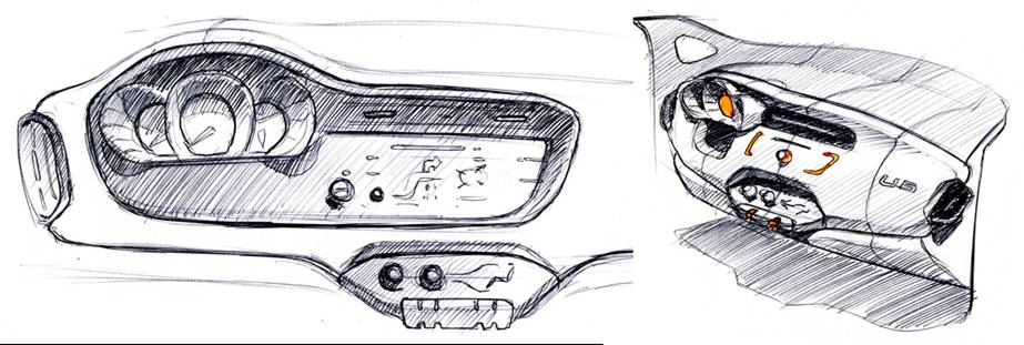
If “modern” and “youthful” were two keywords in decoding Rio’s exterior design, “firm” and “edgy” should be used to interpret its interior. Kia designers wanted to accommodate drivers’ needs to look good and feel good during weekdays when they are going out to work, as well as during sporty weekends.
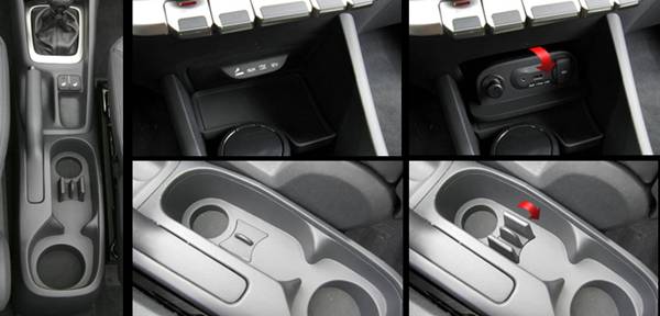
The result is a driver-centered spacious interior that is strong, sporty and comfortable – all in one. The center air vent layout is simple and horizontal, which was inspired by classical looking cars, but the center fascia is solid-looking with three accentuated cylinders emphasizing state-of-the-art technology. Even the arrow inside the speedometer was refined to be more forward-looking. A huge door pocket and a bottle holder are in place to increase storage space and a multi-tray is adopted to the cup holder for maximum storage capability. Designed to handle your desires and needs any day of the week, Rio is a beauty inside and out.
What’s the Meaning of Color? EVERYTHING
It is said that 60 to 80% of our perception relies solely on eyesight while the other 20% is made up of other senses. Kia designers wanted undivided attention from drivers. How? They created new colors from scratch, mixing and matching the colors with countless textile, fabric and materials to capture drivers’ tactile satisfaction as well as giving pleasure to the eyes. The search for the right colors was not an easy fit. Not only did Kia designers consider the environmental factors and surroundings of the would-be drivers of Rio, but they also considered cultural color codes. They wanted the color to scream out luxury, but at the same time give a feather-soft sensation.
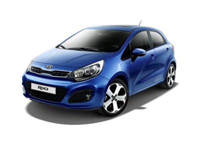
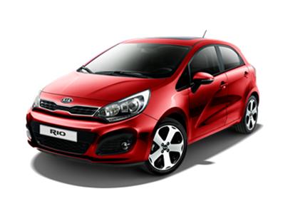
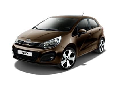
The final three exterior colors for Kia Rio, Wendy Brown, Signal Red and Electronic Blue, were Kia’s answers to their quest. Brown was targeted toward fashion-forward drivers who were stylish and chic. Other colors accentuated Rio’s individualism and dynamic sportiness.
Interior colors were also a result of a very long search for the ‘it’ colors. A black that has a hint of deep blue that glistens in a soft light dubbed “Armani Black,” and a grayish beige that conveys urban luxury were developed for Rio’s interior design.
The parts in the Rio where drivers would rest their hands were carefully thought out. The upper part of the crush pad was placed using IMG or In-mold Graining to give a more luxurious feel to the touch and NPC or Nano PU Cell was used to prevent damages from daily wear.
As I mentioned, design should reflect a company’s passion. The passion of the company should not be lost in translation in the final product. So it shouldn’t be a surprise for readers to understand that Kia’s passion is innovation. A continuous innovation to make a car that wows drivers. The Rio is a fine example of exactly that.
What’s the Meaning of Color? EVERYTHING
It is said that 60 to 80% of our perception relies solely on eyesight while the other 20% is made up of other senses. Kia designers wanted undivided attention from drivers. How? They created new colors from scratch, mixing and matching the colors with countless textile, fabric and materials to capture drivers’ tactile satisfaction as well as giving pleasure to the eyes. The search for the right colors was not an easy fit. Not only did Kia designers consider the environmental factors and surroundings of the would-be drivers of Rio, but they also considered cultural color codes. They wanted the color to scream out luxury, but at the same time give a feather-soft sensation.

